Kùzu
Project Overview
Crafting Identity for Next-Gen Graph Database
Kùzu is an embeddable graph database built for query speed and scalability, positioned to compete with industry giants like Neo4j. As a startup founded by database experts from Stanford University and the University of Waterloo, the team needed to establish stronger brand identity and website that would reflect their technical excellence while being approachable to developers. The challenge was to create a visual language that would communicate both the product's high performance and its ease of use.
My Role
Brand & Web Designer/Developer
Duration
1 months
Team
Designer - Me, Founder - Semih Salihoglu, Co-Founder - Ardan Arac
Tools Used
- Figma
- Illustrator
- SvelteKit
- Typescript
Research & Strategy
Understanding the Technical Landscape
The name "Kùzu" comes from Sumerian, meaning "wisdom" (kù = "bright" + zu = "to know"). This etymological foundation provided rich grounds for visual exploration.
Market Analysis
- • Competitive Landscape
- - Examined branding of major graph databases like Neo4j, Memgraph, and ArangoDB
- - Identified opportunity to stand out with a more modern, developer-friendly aesthetic
- - Analyzed color schemes and typography choices in developer tools and documentation
Technical Differentiators
- • Kùzu offers unique technical advantages that position it competitively in the market:
- - Embeddable nature similar to SQLite and DuckDB
- - Superior performance through columnar storage and vectorized processing
- - Native support for Cypher query language
Target Audience
- • User Segments
- - Primary: Database engineers and developers working on graph analytics
- - Secondary: Data scientists using graph databases for machine learning
- - Tertiary: Technical decision makers evaluating graph database solutions
Logo Design Process
From Flimsy to Solid
The Challenge
Stakeholders expressed concerns that their existing logo lacked visual impact, failed to stand out on websites and presentations, and was only suitable for light UI modes. They sought a modern logo that would effectively communicate the essence of their super-fast embedded graph database.
The original logo lacked visual weight and versatility
Conceptual Exploration
Drawing inspiration from the Sumerian origins of the name "Kùzu," I explored cuneiform writing systems as a visual foundation. Cuneiform characters not only resemble graph structures but also connect to the etymology of the brand name. The embedded nature of the database suggested a parallel to how cuneiform was preserved in clay tablets for millennia—symbolizing how data stored in Kùzu is similarly safe and reliable.
Cuneiform is one of the earliest writing systems, developed in ancient Mesopotamia around 3400 BCE. Its wedge-shaped marks pressed into clay tablets have survived thousands of years—a perfect metaphor for durable, embedded data storage.
Design Iterations
The logo exploration process involved multiple iterations, starting with sketches inspired by cuneiform characters and graph structures. Each iteration refined the concept, balancing historical references with modern design principles.
Exploration of various logo concepts combining cuneiform inspiration with graph database visualization
Color System Development
A robust color system was developed to ensure the logo would work across all contexts—from light to dark interfaces, and from digital to print applications. The primary palette draws from both ancient clay tones and modern tech aesthetics.
- • Color Strategy
- - Primary color inspired by Sumerian clay tablets with modern vibrancy
- - Secondary color designed for technical documentation and UI elements
- - High contrast options for maximum legibility across platforms
- - Dark mode variants with preserved brand recognition
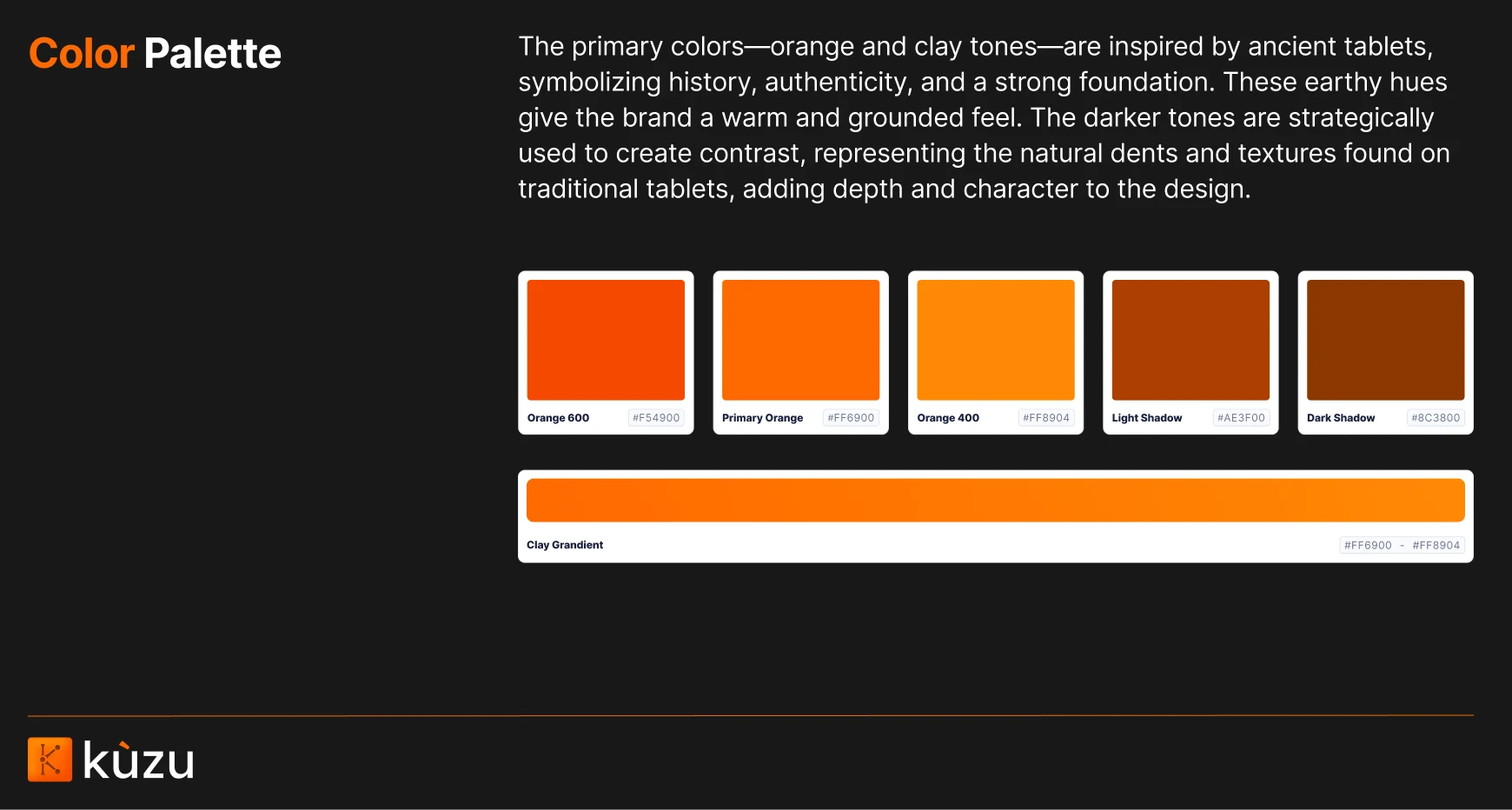
Color System
Final Design
The final logo successfully merges ancient wisdom with cutting-edge technology. The mark features stylized cuneiform-inspired elements arranged in a graph-like structure, communicating both the product's heritage and its technical purpose. The redesigned logo works effectively at various sizes and across different backgrounds, solving the original problems while adding layers of meaning and visual interest.
The final logo design, light and dark mode
View Figma Slides
Logo Creative Brief
To view full design process and details. For full design process including research, iterations, and final implementation of the new Kùzu visual identity.
Website Design
Developer-First Web Experience
As both the designer and developer of the website, I crafted a developer-first experience using SvelteKit, implementing a modern design system with clean typography and UI. The new visual identity, including the redesigned logo and color system, is seamlessly integrated throughout the site, ensuring both aesthetic appeal and optimal developer experience.
- • CTA to new version releases
- • Dark mode support with syntax highlighting optimized for readability
- • Responsive design system that works seamlessly across devices
- • Performance-optimized animations and transitions
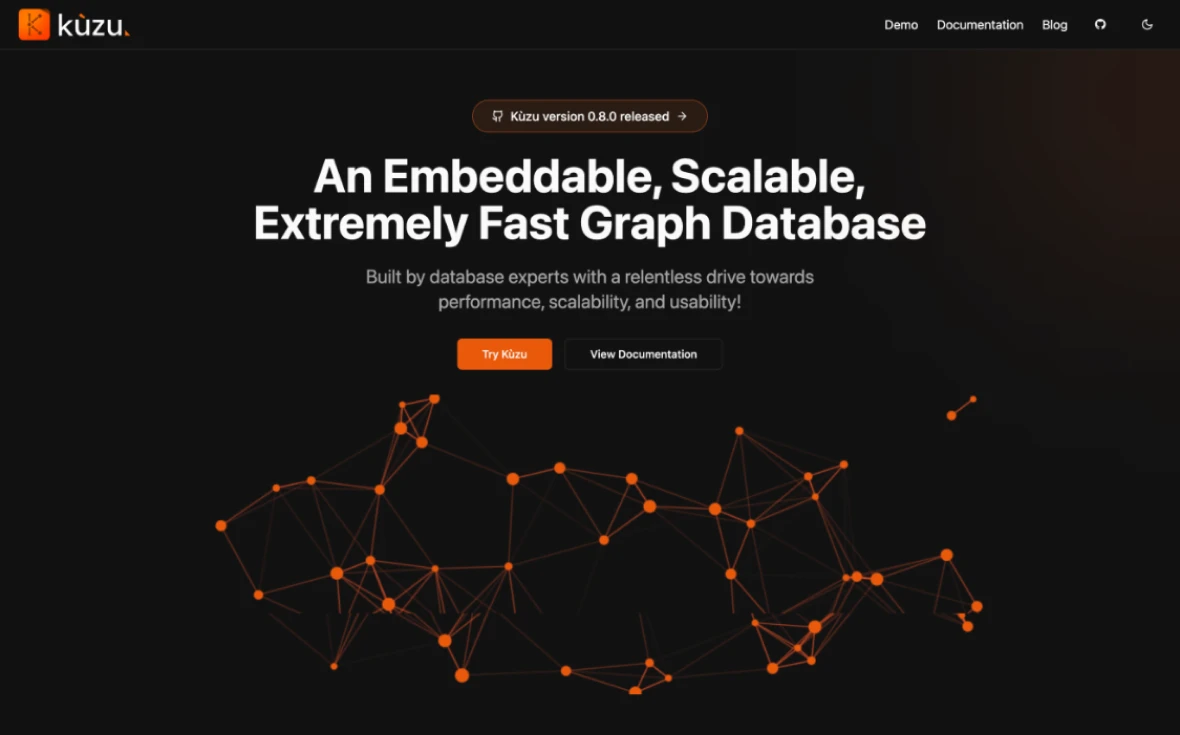
Homepage before design
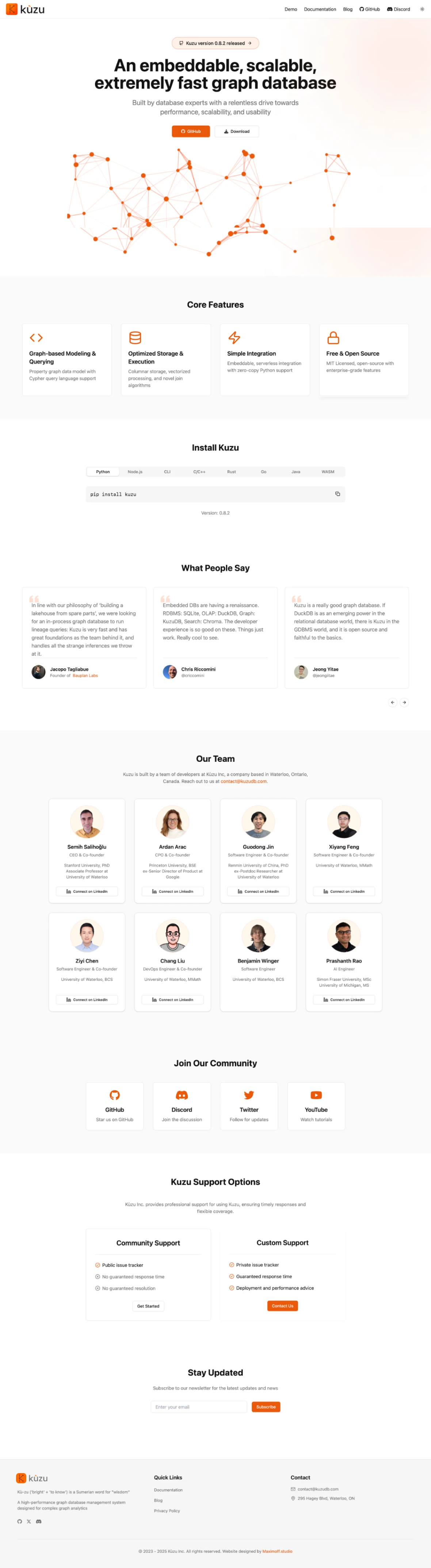
Homepage after design
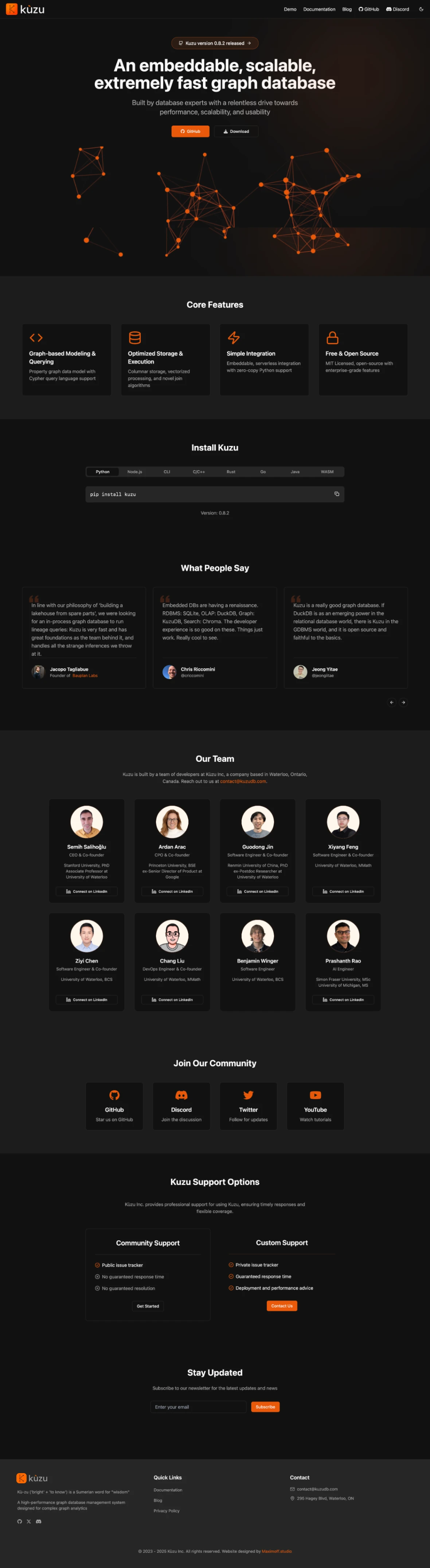
Homepage after design
Visit Website
See it in Action
Experience the new Kuzu website firsthand and explore its developer-friendly features, comprehensive documentation, and interactive code playground.
Client Feedback
What the Kùzu team says about our collaboration
"Kamran re-designed our logo, brand colors and web site at Kuzu Inc. The community and our investors have responded very positively to our new logo and web site. The new logo was a big step up from where we were before - it has a unique design that stands out among competitor's logos. It's thoughtfully designed based on what our company does and how we are trying to differentiate ourselves. Most importantly, it's beautiful. Kamran also made our web site modern and elegant. Kamran works fast and gets things done efficiently. He is also receptive to feedback and iterates with us when needed. I strongly recommend Kamran for branding, logo design and web site design."